Cosmopolitan's cover for its February issue about honor killings and violence against women is chilling, captivating, and gets the point across immediately. Read more about the cover and issue here.
Showing posts with label design. Show all posts
Sunday, January 18, 2015
Monday, September 15, 2014
Tuesday, September 9, 2014
Wednesday, February 12, 2014
The Complaint Department
Power of Design 2014: Complaints is a gathering of designers, writers, and thinkers for a series of events and exhibitions at The Wolfsonian museum in Miami Beach from March 22-24. The poster exhibition portion of the event, entitled Complaints! An Inalienable Right, is curated by Steven Heller and showcases posters by major designers airing their own complaints. A new poster in the series is posted each day on the blog for the exhibition, a sampling of which can be seen here with captions from the blog. I especially love Milton Glaser's sentiment that "Certainty is a closing of the mind."
Jeff Scher is filmmaker, animator, and teacher whose work appears frequently in the New York Times. He teaches at New York University and the School of Visual Arts in the MFA graphic design program. He notes that his poster "is about global weirding-fueled rising sea levels and how it endangers everything coastal, including New York City. It is a subject that Hurricane Sandy made personal when it destroyed my coastal Brooklyn Studio."
Viktor Koen is on the faculty of the School of Visual Arts (SVA). His work has been exhibited in galleries and museums nationally and internationally, and his images regularly appear in publications including the New York Times, the Wall Street Journal, and Nature magazine. The bottom of this poster, Koen explains, adds "insult to injury" through "very unreliable science." It lists the percent of adults per state in the last year "with significantly damaged looks due to direct smoke exposure of their face."
Milton Glaser is among the most celebrated graphic designers in the United States. You've seen his work: he designed the iconic I (heart) NY logo in 1976. His many accomplishments include: one-man shows at the Museum of Modern Art and the Georges Pompidou Center; the National Medal of the Arts award; and lifetime achievement awards from the Cooper Hewitt National Design Museum and the Fulbright Association. He co-founded Push Pin Studios and New York Magazine. In 1974, he opened Milton Glaser, Inc., where he continues to produce a prolific amount of work. Of this poster, he comments: "I don't know where it came from, but some years ago I read or heard the phrase, 'Certainty is a closing of the mind.' I quite agree."
Saturday, June 8, 2013
Calgary Zoo Annual Report
Trigger Communications' annual report for the Calgary Zoo is an incredibly smart and creative way of using the popularity of Instagram for business purposes. Take a look at some of the photos below and see the full thing here.
(via designworklife)
Labels:
annual reports,
branding,
design,
identity,
photography
Friday, June 15, 2012
Origami Invite
WOW—this origami invitation to the opening of a Louis Vuitton store in Japan is awesome. Designed by Happycentro.
(via Design Work Life)
Wednesday, June 13, 2012
blacknegative
blacknegative's site is one of the coolest I've seen in a while. I had a lot of fun playing around with it (photos don't do it justice—go to the site to get the full interactivity!)—and their work is great, too.
Monday, June 11, 2012
The Funnel
Tuesday, May 15, 2012
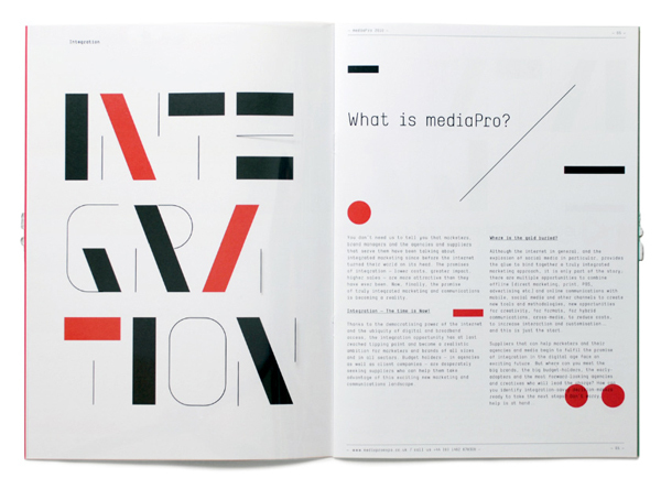
mediaPro brochure by SAWDUST
Great paper choice by SAWDUST in their brochure for mediaPro—not just because it looks pretty, but also because it furthers the meaning they're trying to convey.
Wednesday, October 26, 2011
Two new ways to waste time
Two new websites to check out for all your (unrelated) humorous needs:
1. Halloween or Williamsburg - Is that a costume?
2. Trend List- Design trends seen a lot. Not really sure if this one is supposed to be humorous, but it is..to me, at least.
1. Halloween or Williamsburg - Is that a costume?
2. Trend List- Design trends seen a lot. Not really sure if this one is supposed to be humorous, but it is..to me, at least.
Tuesday, August 9, 2011
Friday, July 8, 2011
Guinness Genius
This ad by Frank Anselmo for Guinness is old (2001), but I've never come across it, and it's pretty brilliant. The matches emulate the look of a pint of Guinness. Read more about his work here.
Friday, June 17, 2011
You or You
Oh Debbie Millman, I heart you so.
Check out her newest illustrated essay, You or You.*

*If you haven't read her book Look Both Ways, do so now.
Check out her newest illustrated essay, You or You.*

*If you haven't read her book Look Both Ways, do so now.
Thursday, June 16, 2011
Wednesday, June 15, 2011
Booki.sh
Have you seen A Friend of Mine's branding work for Booki.sh? Even though it's been all over the internet lately, I can't resist posting it here. That glasses-shaped "B" really got me...


(via design work life)


(via design work life)
Wednesday, May 11, 2011
Amazing design advice
While perusing Young Jerks/Dan Cassaro's portfolio, I came across the following bit of wisdom, a tidbit from his 10 Tips:

Kind of a brilliant analogy, no? Be sure to check out the rest. I got a good laugh.
There are two types of designers: Lennons and McCartneys. As a John Lennon, you create work that is message-driven, stark and serious, but you run the risk of seeming pretentious and/or naïve. (In John Lennon's defense, he was unfortunately married to the world's worst art director.) To be a Paul McCartney, on the other hand, means creating beautiful, meticulously crafted graphic design pop music, heavy on style but light on content. While either can be successful on its own (I love Wings), the best design employs both ideology and style. (See: popular music group "The Beatles").

Kind of a brilliant analogy, no? Be sure to check out the rest. I got a good laugh.
Tuesday, April 12, 2011
Posters of Fortune
This idea is pretty rad.

As described on the site,


As described on the site,
Some of my favorites:The Type Directors Club in conjunction with Cardon Copy presents POSTERS OF FORTUNE: 21 Fortune cookies, with 21 distinct fortunes, have been sent to 21 internationally renowned designers. The designers have in turn transmuted these personal divinations into richly imagined typographical posters. See them, bid on them, come hear the designers discuss them.
POSTERS OF FORTUNE is on display at the TDC from April 5th – May 12, 2011. The end event and final bids will take place on May 12th from 6:00 – 9:00pm


Friday, March 4, 2011
Tangible Design
I'm having fun playing with Issuu.
Check out my thesis book, Tangible Design. And check out HOW Magazine's March 2011 issue to see some spreads from the book in the International Design Awards!
Open publication - Free publishing - More thesis
P.S. If you're reading this in Google Reader or a similar RSS feed, you might have to click through to see the embedded book. Click on the embedded image to view fullscreen!
Friday, January 28, 2011
Bold Bald
Steph Devlantes rebranded bald. That's a success if I ever heard one.
Also, her other work is good, so check it out.


(via design work life)
Also, her other work is good, so check it out.


(via design work life)
Monday, January 24, 2011
Senior Library
I love, love, love Louise Fili Ltd's book design for SVA's Senior Library, which masquerades as a box of chocolates. The design was illustrated from scratch, along with much of the lettering. As usual, beautiful work from her studio.


Subscribe to:
Posts (Atom)